- A horribly common misconception about Computer Scientists and Software Engineers is that coding is easy. I have seen and heard of many instances where people have interpreted it as “just pressing buttons” and it really bothers me. There are a incredibly large variety of reasons as to why coding is not easy, and I would like to make them more obvious.
- Coding is no simple task, it takes lots of things going into it to make the process work correctly. The sentence I really want to focus on all of the process that goes into coding besides just the coding, as it is a lot of work that can be somewhat obvious.
- The people who need this information most are those who would be working directly with SE’s or CS’s but are not necessarily knowledgeable about the same stuff.
- The goal is that by delivering the complexity of what goes into coding beyond just writing the code it will show that a developer has much more to think about in a project than just the coding of it. Visually representing the behind the scenes steps will add on a visual layer that should make it more easy to understand what these process are and are like.
- “America the Ammo Dealer (and Buyer)” and visual recipes are two different info graphics that show a sort of progression in interesting ways.
-
- Reasons why people have developed the misconception
- Steps in the coding process
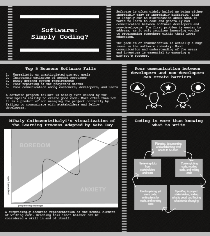
The initial misconception that I had wanted to address was the misconception that non-software developers thought software was just typing. To do this my infographic was going to show the variety of non-programming related activities that go into the development process, and ultimately that is what it became. My infographic visualizes the steps that developers must go through when working on hard problems and lists some of the wide most likely ways a project can fail. My illustration of a developer working with a non-developer shows that simple ideas can be both misunderstood and poorly represented. My cycle diagram illustrates the repetitive project life cycle where very little time is actually spent coding compared to everything else. There were a lot of examples and situations that I decided to cut out in order to focus more on the process and ideas behind everything rather than scenarios. This involved removing a lot of text and turning text into visuals like the communication block for example.
I am definitely most proud of two graphics on the right of my infographic, and the bottom right one in particular has a lot of good information that I think I summarized well into small boxes. I also just think I managed to use my space very well to create something that actually looks good and is informative and interesting. That is probably the one thing I learned the most about data visualization. Taking space, especially a limited space like the 800 by 900 pixel page I chose to limit myself to, and putting good information that is both informative and appealing to look at is incredibly hard. Most of the entire time I worked on my infographic I couldn’t help but think, “I hate how this looks,” but in the end I think it has become something that uses its space well and in a decently appealing way.


I think a big part of why this misconception has taken hold is that it is vastly oversimplified in the media. Have you seen that one comic comparing “movie scientists” with “real scientists” side by side? I feel like that could also be sort of inspiration, though it’s not an infographic. I’m really interested to see how you incorporate the recipes infographic.
LikeLike
I think this is a great misconception to tackle! And Madeline might be right that the media has some role in our misunderstanding. Your ideas of research are great–I wonder if you could even have a sidebar that shows some details from a particularly complex project just to make something simple. Or the amount of code that goes into a single app?
LikeLike
Bib Board Comments:
1. One of the pins doesn’t have a description and one only has a one sentence description (both Moodle sources), other than that it looks good. Make sure all of the Moodle sources are accessible to whoever is reading your board and not just to you.
2. The captions do a really good job of summarizing the sources used, but they could expand more on how they are relevant to the project/how you will use them. Also, make sure all pins have at least two sentences.
3. I think you have a good variety of information and I can’t think of anything major you are missing. However, I know very little about coding.
4. It looks very good, one thing you could do to make your board look more appealing is use different images for the Moodle sources to differentiate them since they are all the same right now.
LikeLike
Infographic Peer Review
1. My take away from this infographic is that when software projects fails it is not typically the fault of the developer.
2. The text of this graphic laid out the main point and the list of 12 reasons helped solidify this.
3. I didn’t understand the graphic in the bottom left and how it related to the rest of the infographic.
4. I feel like the design of this graphic could be better. I felt that the sheer amount of text made the graphic feel very cluttered. I would also like to see a little more color. I understand the choice for the colors used but the graphic as a whole seems fairly dark. Also, see above about the graphic on the bottom.
5. I would find a way to present the information with a little less text. Maybe make the FAA story a little more graphical instead of pure text. Also, I would explain the graphic on the bottom and considering adding another element in the bottom right.
LikeLike